Redesign of Ninjavan's Logistics Dashboard for SEA Merchants

I led the redesign of Ninja Van's Logistics Dashboard to make it easier to use for 35,000+ merchants in Southeast Asia.

3x

Easier to use (based on SEQ)

3x

Easier to use (based on SEQ)

3x

Easier to use (based on SEQ)

Timeline

Q1 2018 - Q3 2018

What we shipped

A revamped responsive webapp

My Role

Product Designer

SKILLS

Research (Regional)
Rapid Prototyping
UX/UI Design
Design System

Context

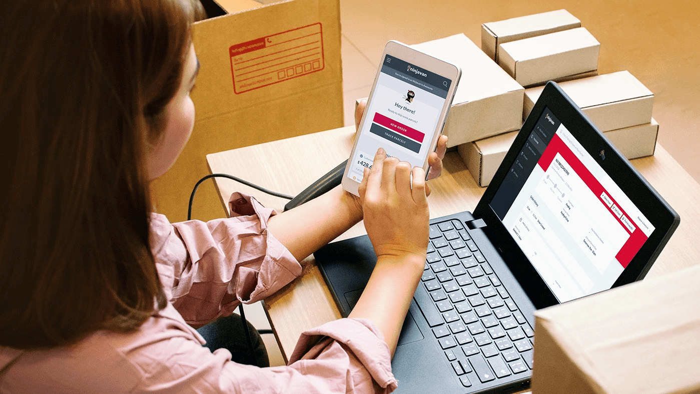
Ninja Van is one of Southeast Asia’s biggest logistics unicorn, primarily focused on delivering parcels from e-commerce merchants to their customers.

Although Ninja Van had a web app, adoption was low. Instead, merchants heavily relied on account managers and customer service to help them with basic tasks. This sapped precious company resources. Ninjavan wanted to change that.

Why weren't merchants using the self-serve web app? How could we increase adoption?

The old merchant web app.

The old merchant web app.

The old merchant web app.

Research

We conducted 65+ user interviews in 7 Southeast Asian countries with the merchants who shipped with us, and internal interviews with colleagues in departments interfacing with our merchants.

Insights

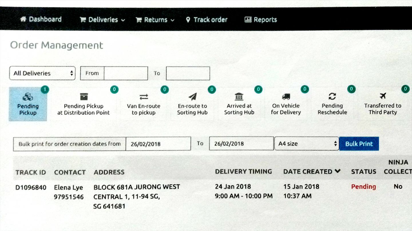
Current designs were too complicated

Merchants tended to be unfamiliar with work apps and desktop devices as their first introduction to technology was through mobile

Merchants had diverse user needs and priorities

Merchants had different processes and internal roles, so they struggled to know which parts of the app was useful to them

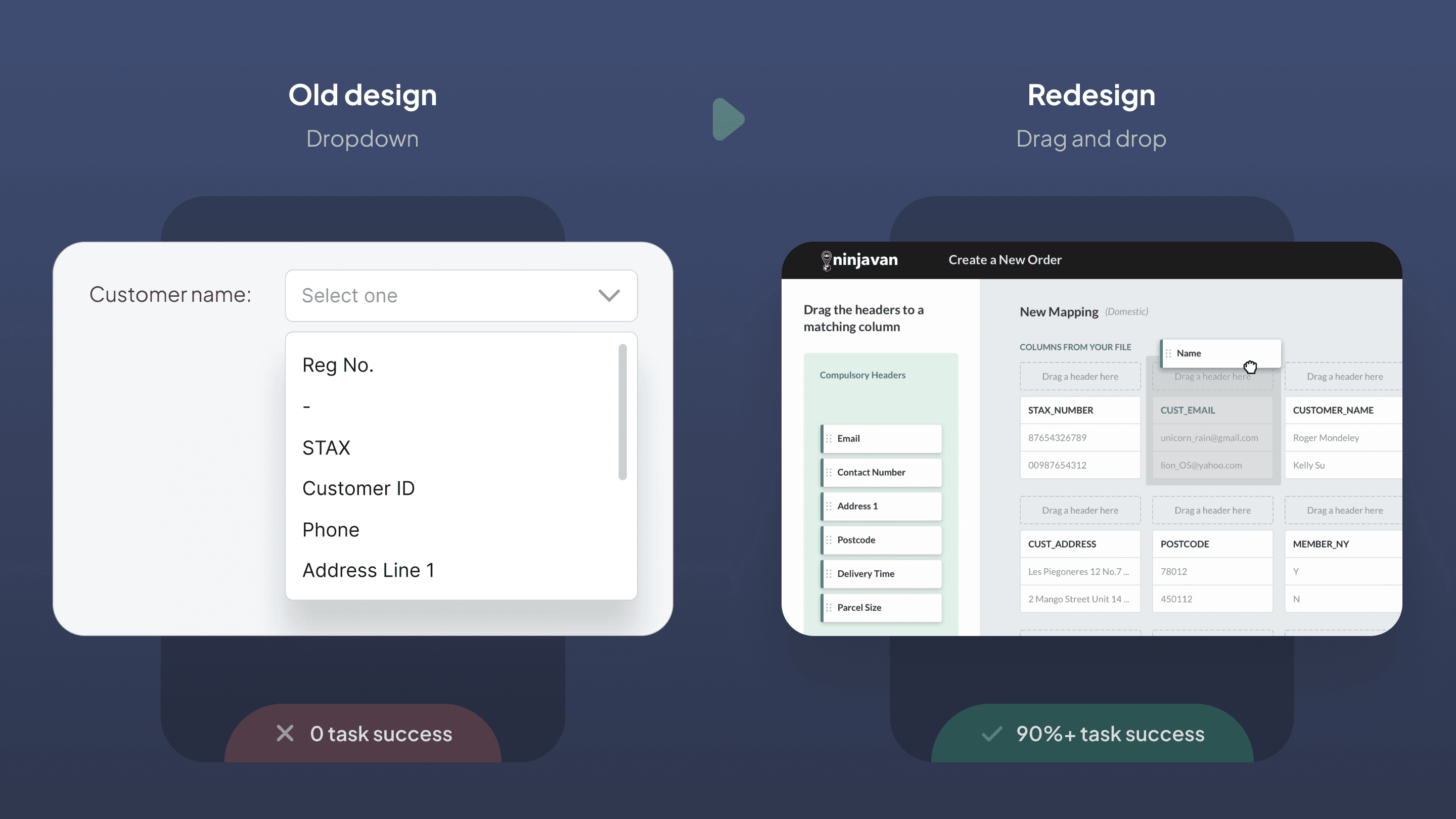
Fear of making mistakes

Users tended not to ‘click around and explore’ because any mistakes could have adversely impact deliveries and jeopardise their job performance.

Approach

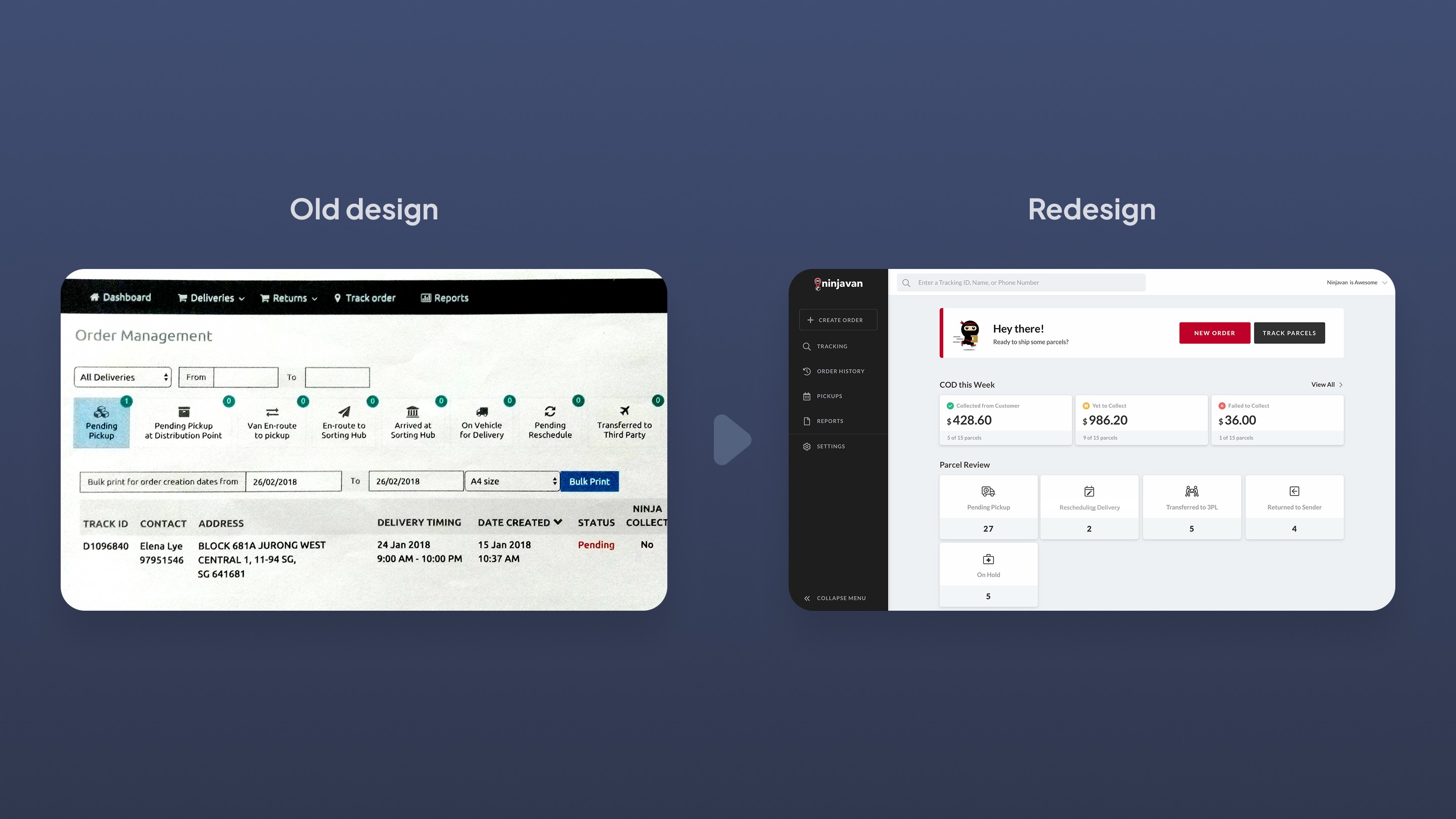
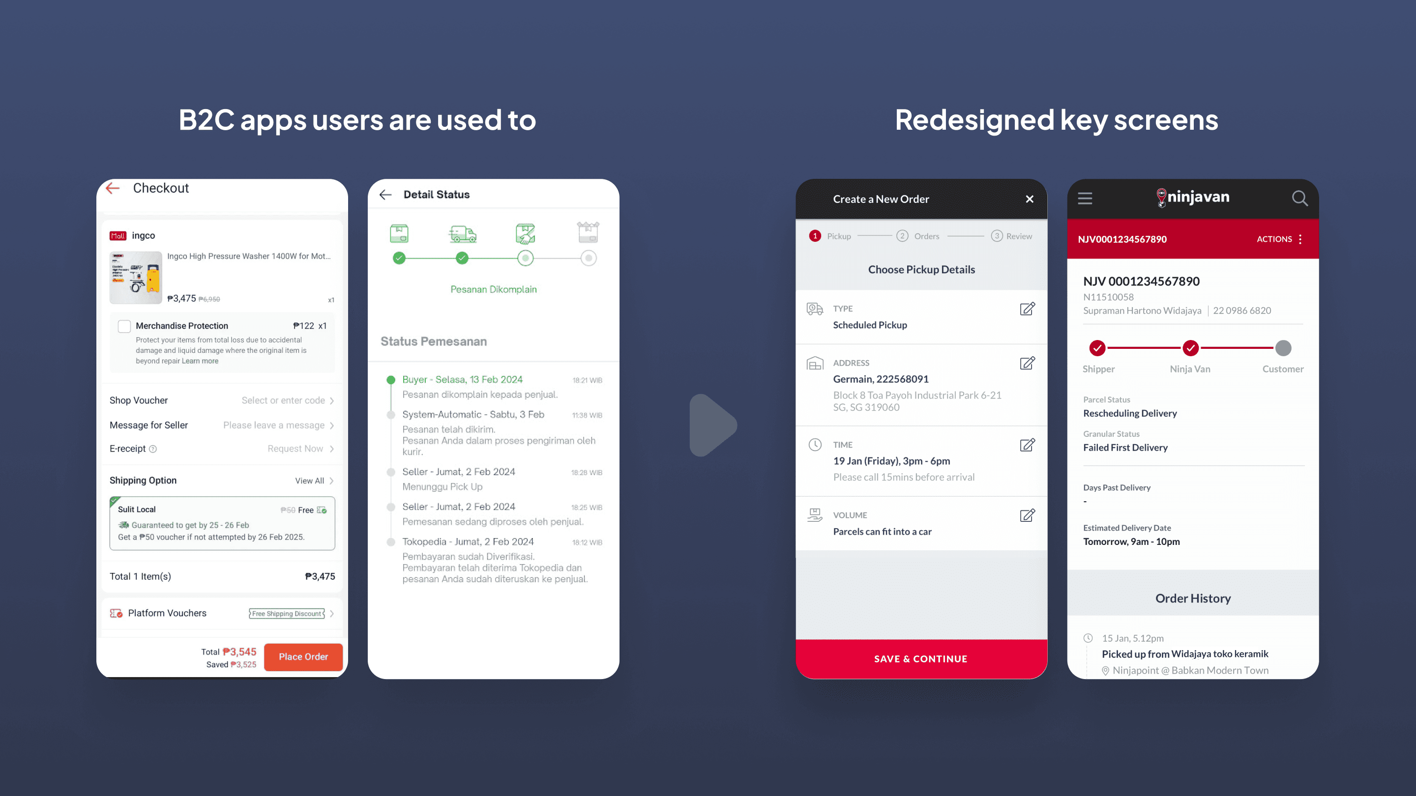
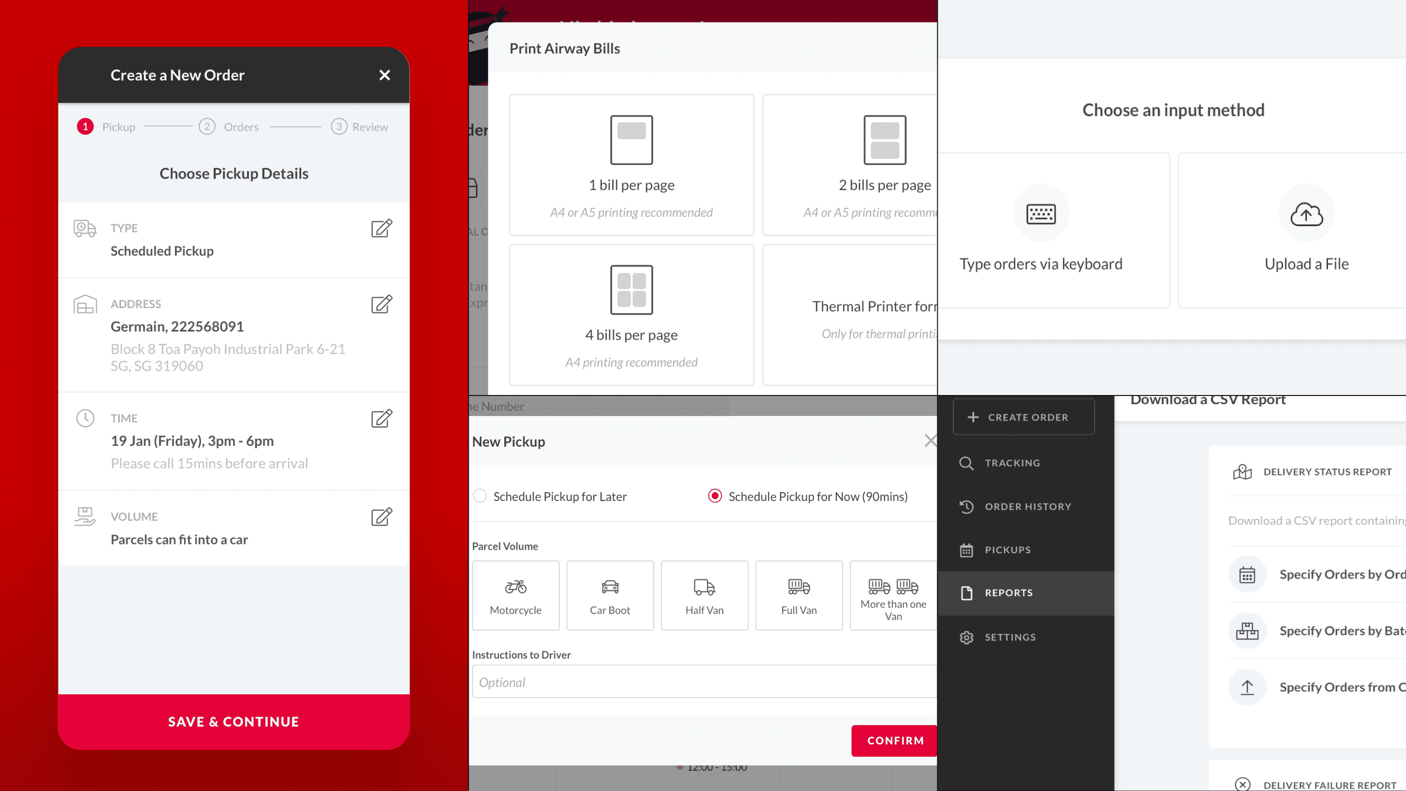
The web app was complex because it had many features that were essential to the delivery process. Since we couldn’t reduce the inherent complexity, I focused on reducing the perceived complexity.

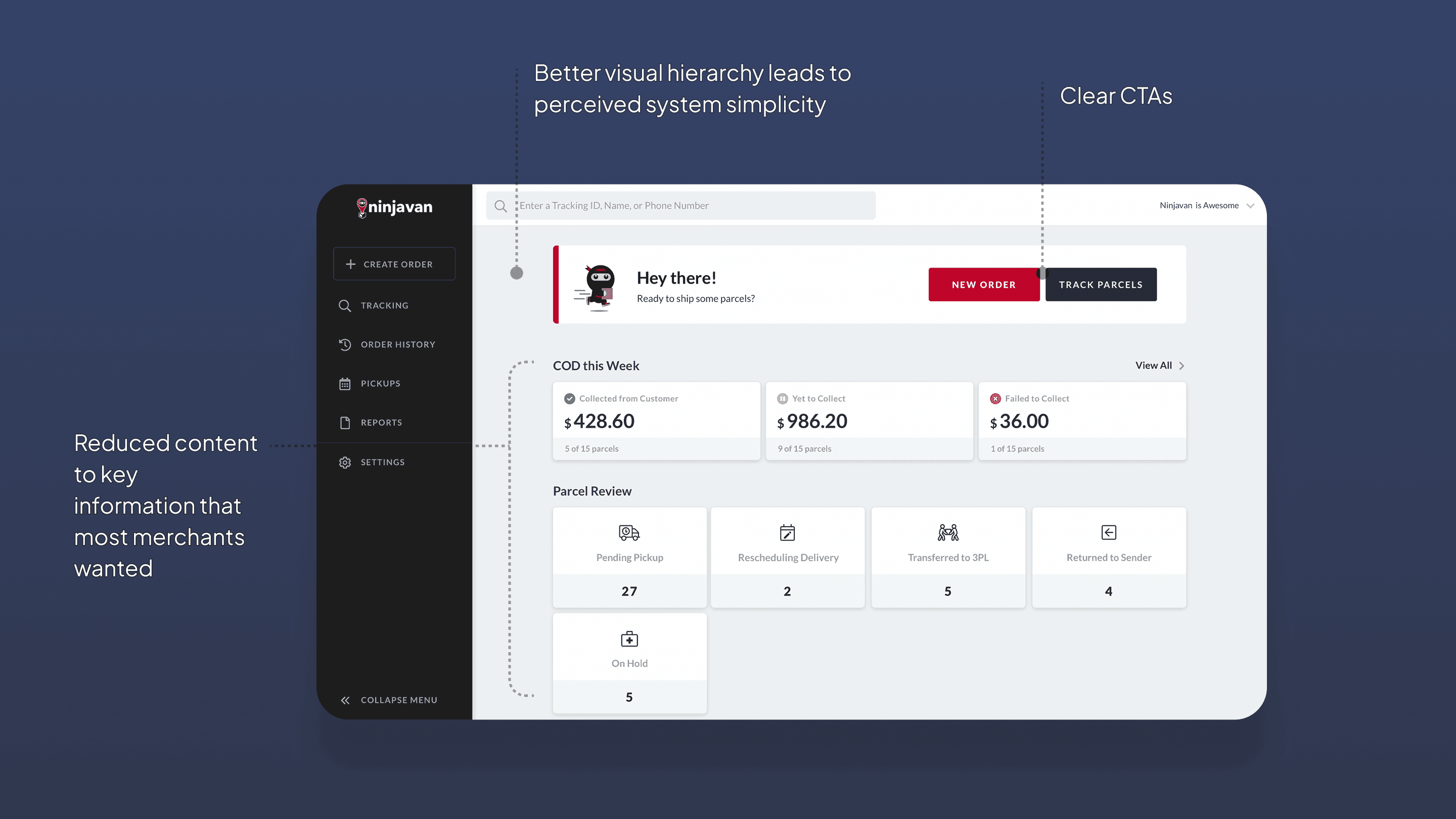
Creating clarity and simplicity

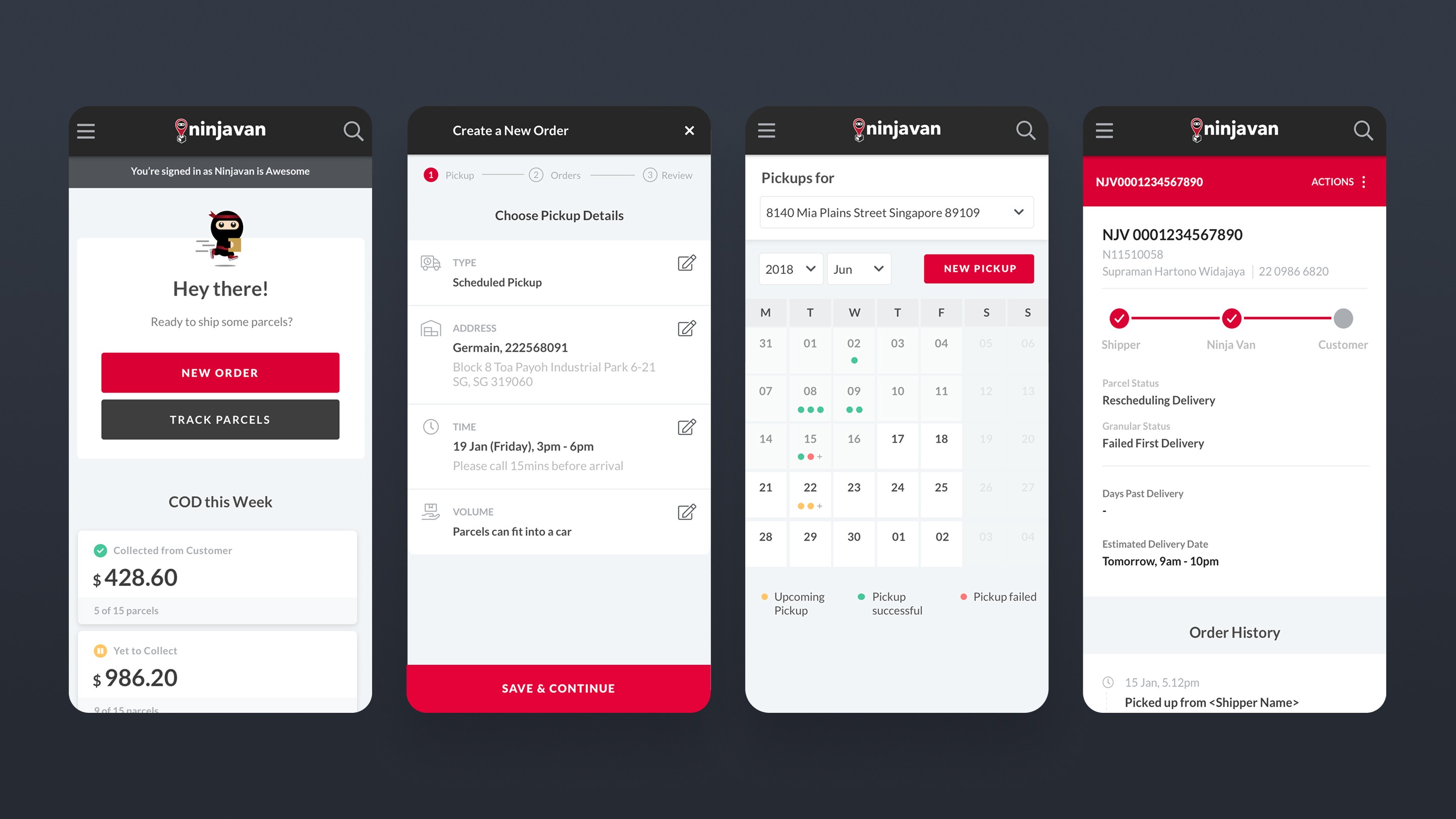
I simplified the experience of the app by introducing better visual hierarchy, access to key information, and streamlined workflows.

Before and after

Before and after

Before and after

The dashboard was redesigned around the 3 primary tasks a merchant does. Even secondary tasks are only 1 click away.

The dashboard was redesigned around the 3 primary tasks a merchant does. Even secondary tasks are only 1 click away.

The dashboard was redesigned around the 3 primary tasks a merchant does. Even secondary tasks are only 1 click away.

Flows and decisions were greatly simplified.

Flows and decisions were greatly simplified.

Flows and decisions were greatly simplified.

A comprehensive walkthrough of the dashboard showing how we simplified the process for users. Unfortunately this video is only available in Indonesian.

A comprehensive walkthrough of the dashboard showing how we simplified the process for users. Unfortunately this video is only available in Indonesian.

A comprehensive walkthrough of the dashboard showing how we simplified the process for users. Unfortunately this video is only available in Indonesian.

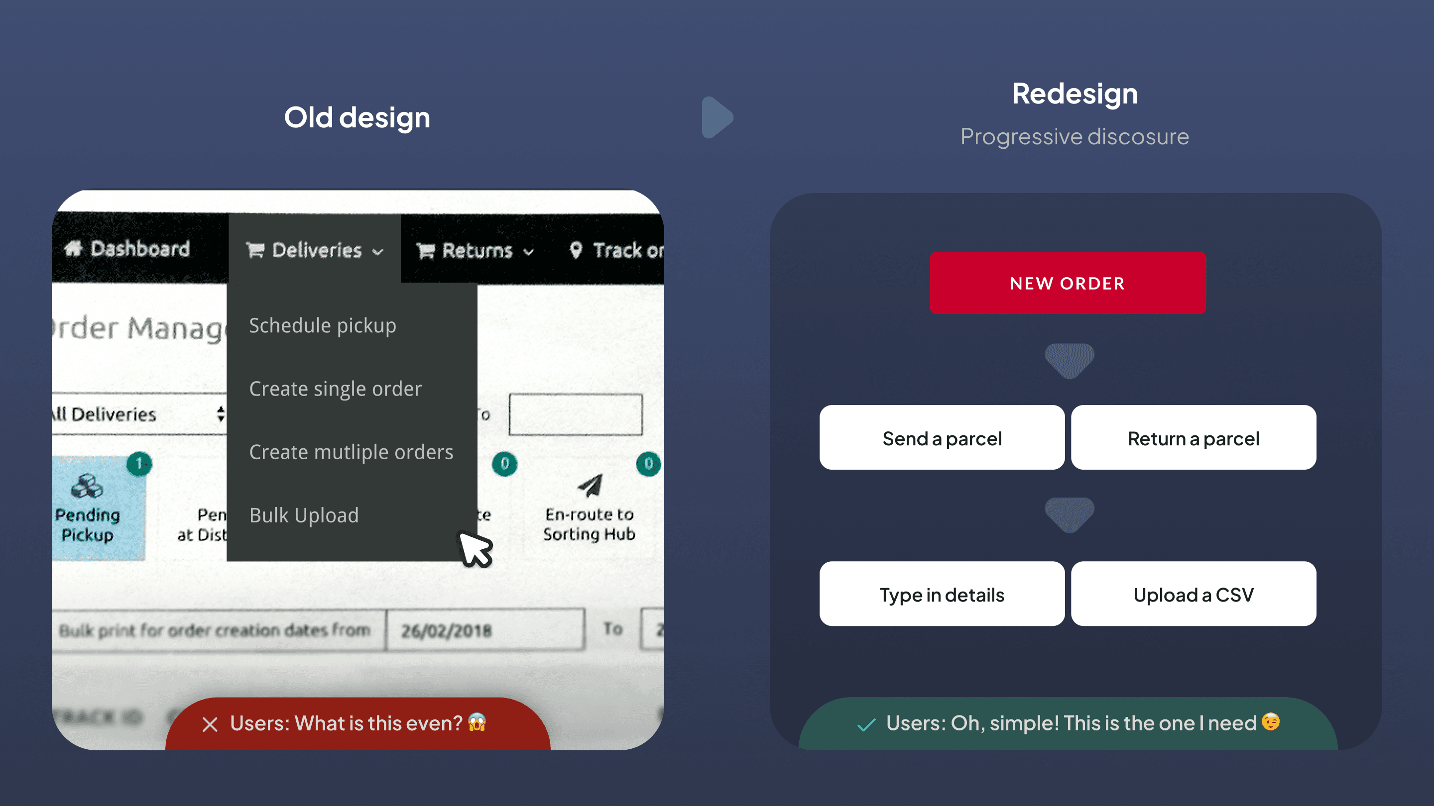
Making abstract concepts simple

Abstract enterprise software operations were difficult for many SEA users to understand due to varied education levels and tech familiarity.

To help users better grasp concepts, I redesigned features to fit into mental models they were familiar with in their lives.

Ecommerce shopping was something many users were familiar with. To make our B2B app more approachable, I based interaction elements and models around familiar elements.

Ecommerce shopping was something many users were familiar with. To make our B2B app more approachable, I based interaction elements and models around familiar elements.

Ecommerce shopping was something many users were familiar with. To make our B2B app more approachable, I based interaction elements and models around familiar elements.

The new Drag and Drop interface improved user comprehension from less than 5% to 90+%.

The new Drag and Drop interface improved user comprehension from less than 5% to 90+%.

The new Drag and Drop interface improved user comprehension from less than 5% to 90+%.

Designing for emotional needs

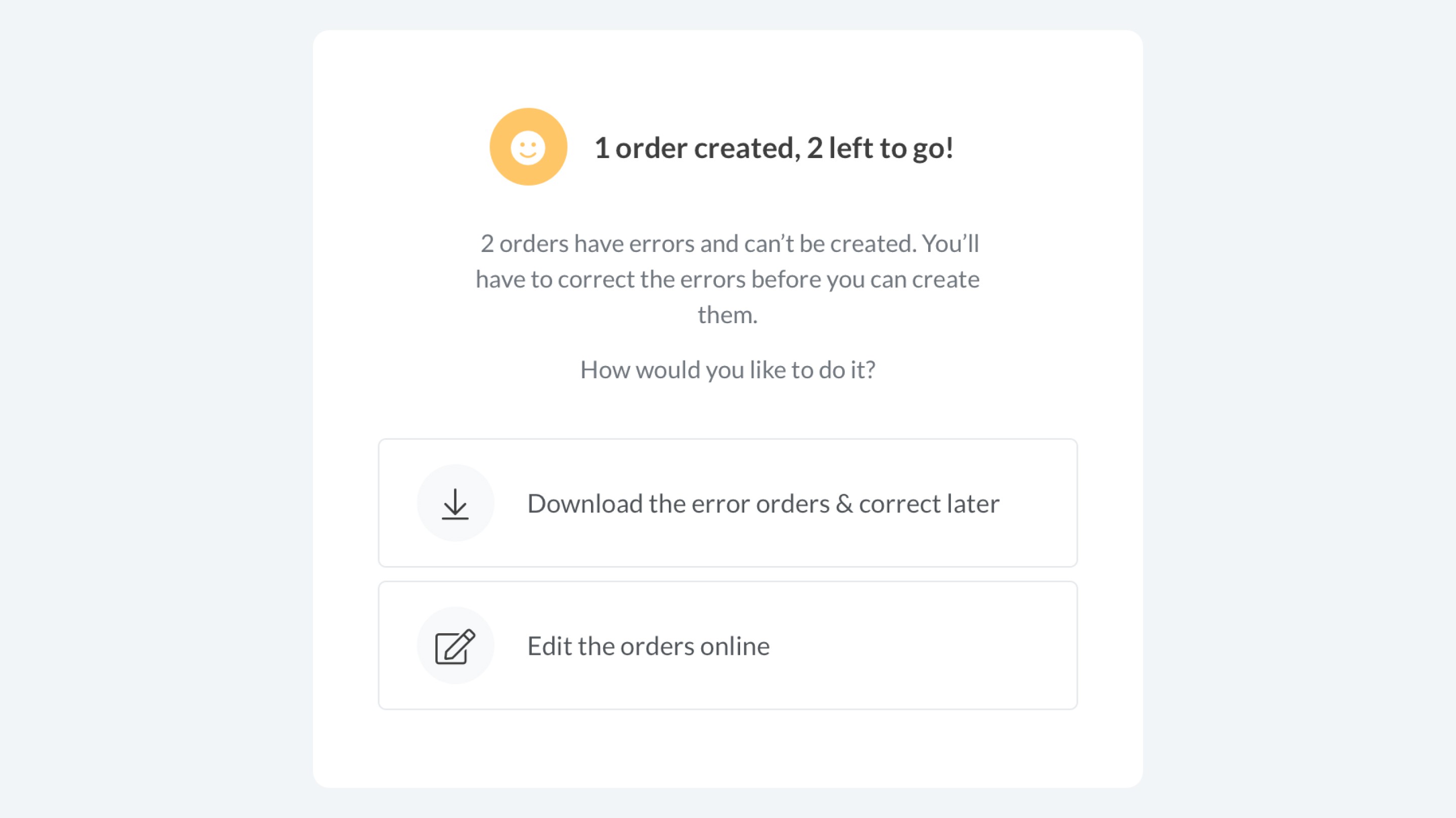
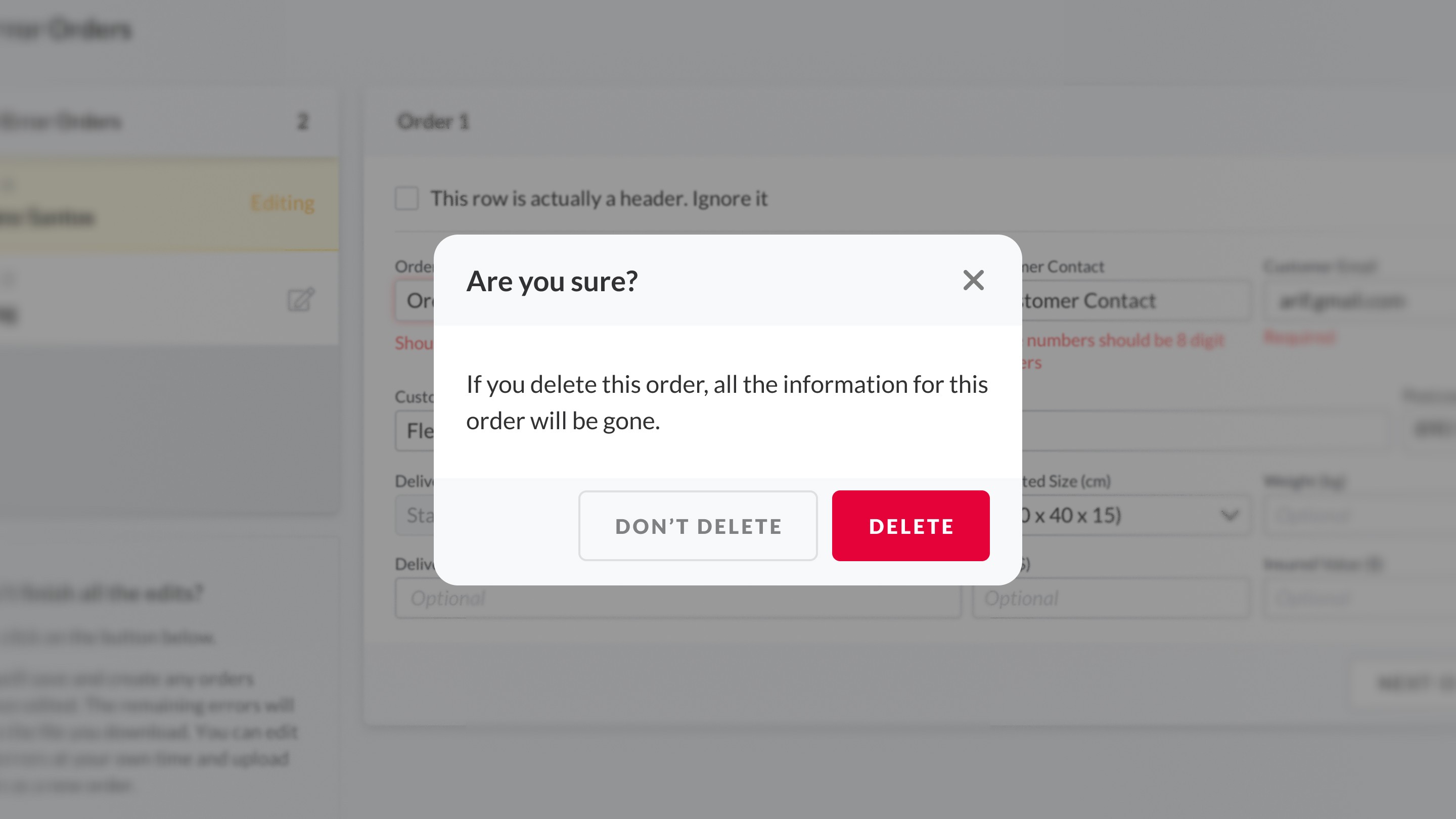
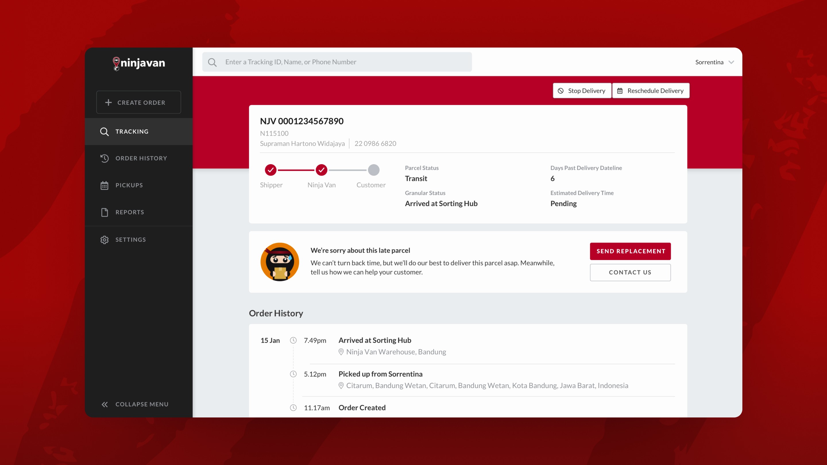
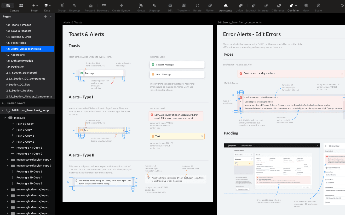
Error handling was another important part of the redesign. Our merchants frequently panicked if the system showed errors, so creating an experience that de-escalate that panic was essential to get users to trust the software and use it more often

In the redesign, I downplayed 'errors', and created a system that proactively prevented mistakes.

Errors that happened during creating parcel orders are downplayed (note the use of yolk yellow instead of red for the error), with error correction methods cleanly presented.

Errors that happened during creating parcel orders are downplayed (note the use of yolk yellow instead of red for the error), with error correction methods cleanly presented.

Errors that happened during creating parcel orders are downplayed (note the use of yolk yellow instead of red for the error), with error correction methods cleanly presented.

Although a History function is best practice, from usability testing I learnt that users preferred a 'Are you sure?' mechanism as they felt more secure when the software prevented them from making any errors.

Although a History function is best practice, from usability testing I learnt that users preferred a 'Are you sure?' mechanism as they felt more secure when the software prevented them from making any errors.

Although a History function is best practice, from usability testing I learnt that users preferred a 'Are you sure?' mechanism as they felt more secure when the software prevented them from making any errors.

Designing for accessibility

By observing our merchants worked, I also identified hidden accessibility needs that I then designed for.

highlights

Increased use of icons to guide users (as opposed to text)

To bridge the education an tech disparity in SEA.

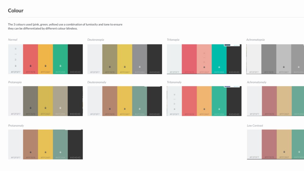
Colour accessibility

To address readability on older screens and colour blindness in the logistics industry.

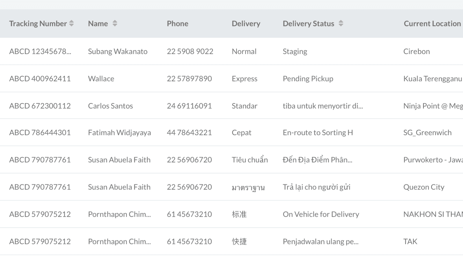
Space for differing linguistic lengths

To ensure the UI supported the diverse languages and word length in SEA.
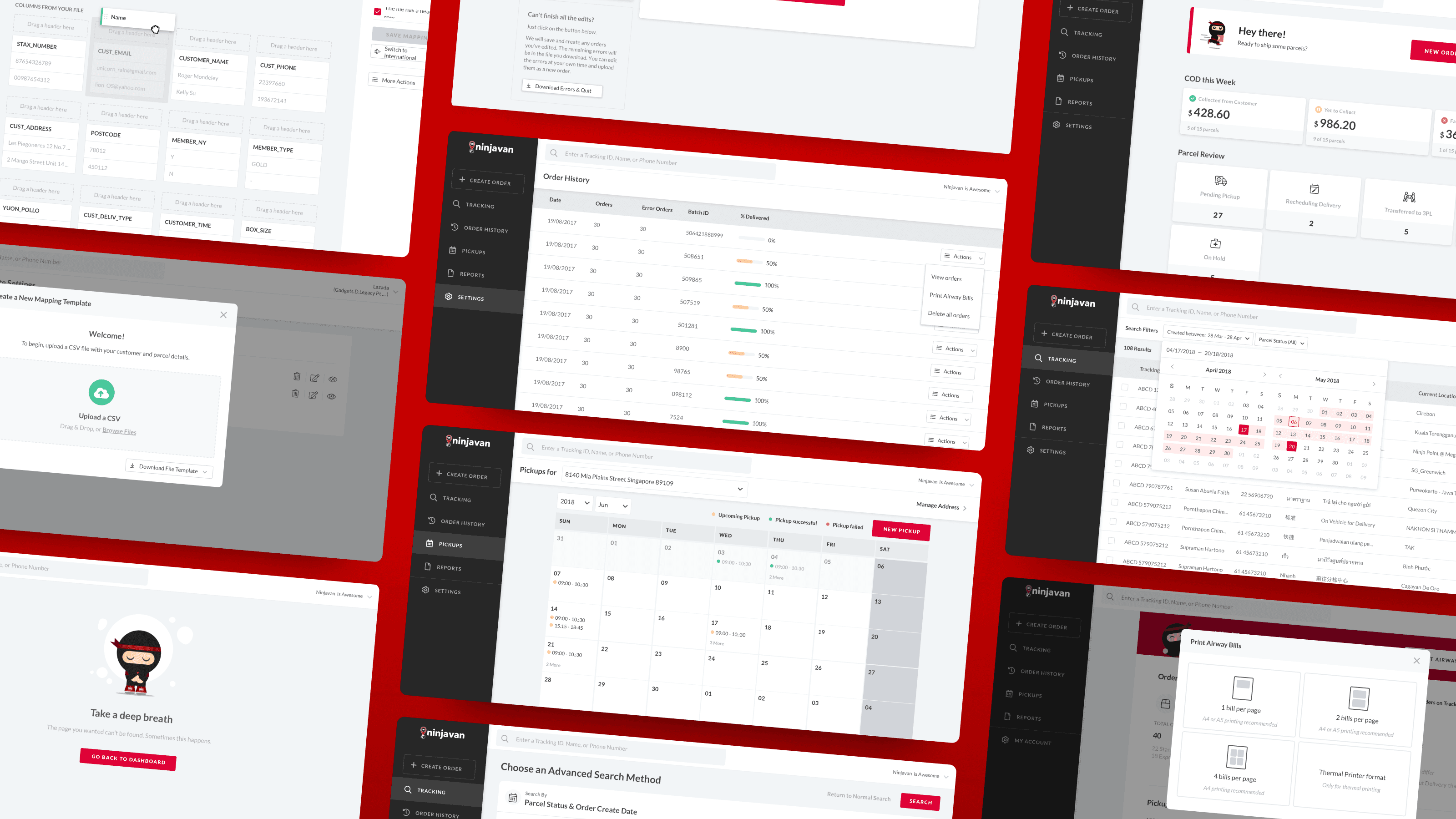
Icons were used abundantly to help low-literacy users navigate the interface.

Icons were used abundantly to help low-literacy users navigate the interface.

Icons were used abundantly to help low-literacy users navigate the interface.

Checking that status colours could be differentiated by all 10 kinds of colour-blindness. Colour blindness was a crucial consideration as the logistics industry is disproportionately staffed by men, who have a 5.5%+ prevalence for colour blindness in Asia.

Checking that status colours could be differentiated by all 10 kinds of colour-blindness. Colour blindness was a crucial consideration as the logistics industry is disproportionately staffed by men, who have a 5.5%+ prevalence for colour blindness in Asia.

Checking that status colours could be differentiated by all 10 kinds of colour-blindness. Colour blindness was a crucial consideration as the logistics industry is disproportionately staffed by men, who have a 5.5%+ prevalence for colour blindness in Asia.

Language stress tests on key components to ensure the interface would work across languages.

Language stress tests on key components to ensure the interface would work across languages.

Language stress tests on key components to ensure the interface would work across languages.

Visual design

I followed Ninja Van's brand colours of red and black to create a UI.

With my UI skills now I wished I did a better job, but that mild embarrassment  everyone feels looking at old work is called ‘Growth’. 😉
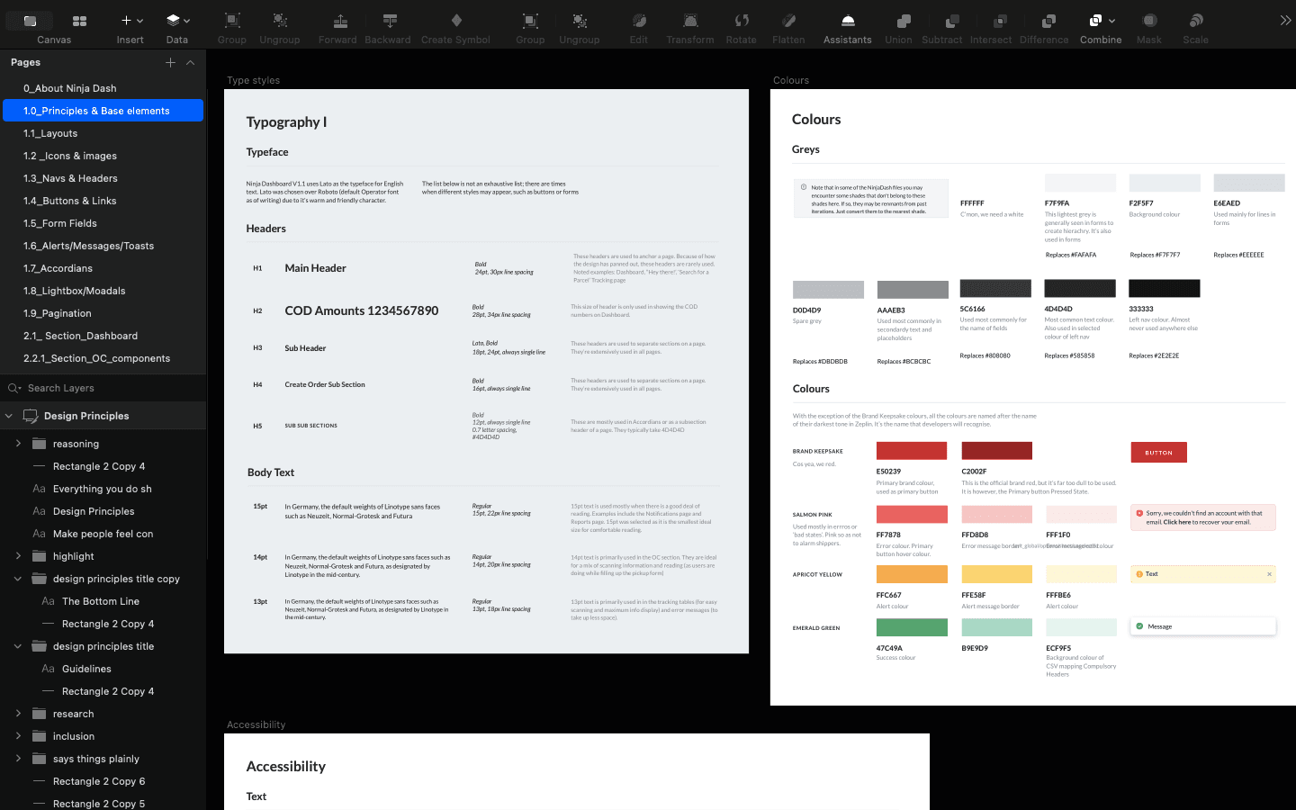
Design System

Over time, we amassed a lot of UI components which I organised and documented in a UI kit in Sketch (this was 2018).

This document provided developers, designers, and PMs a common point of reference, thus making standardisation between design and code a lot easier.

Foundations of the system.

Foundations of the system.

Foundations of the system.

Components were documented and redlined in a Sketch document (this was 2018). Corresponding React components existed for our developers

Components were documented and redlined in a Sketch document (this was 2018). Corresponding React components existed for our developers

Components were documented and redlined in a Sketch document (this was 2018). Corresponding React components existed for our developers

Results

After 8 months of hard work, we launched in August 2018 to a group of beta users. The redesigned led to these results:

35,000+

Users across 7 Asian Countries

35,000+

Users across 7 Asian Countries

35,000+

Users across 7 Asian Countries

3x

Easier to use (based on SEQ)

3x

Easier to use (based on SEQ)

3x

Easier to use (based on SEQ)

90-100%

Task success

90-100%

Task success

90-100%

Task success

Continue browsing

Create a free website with Framer, the website builder loved by startups, designers and agencies.