Buiding YouTrip Overseas Transfer
Context
Leadership impact
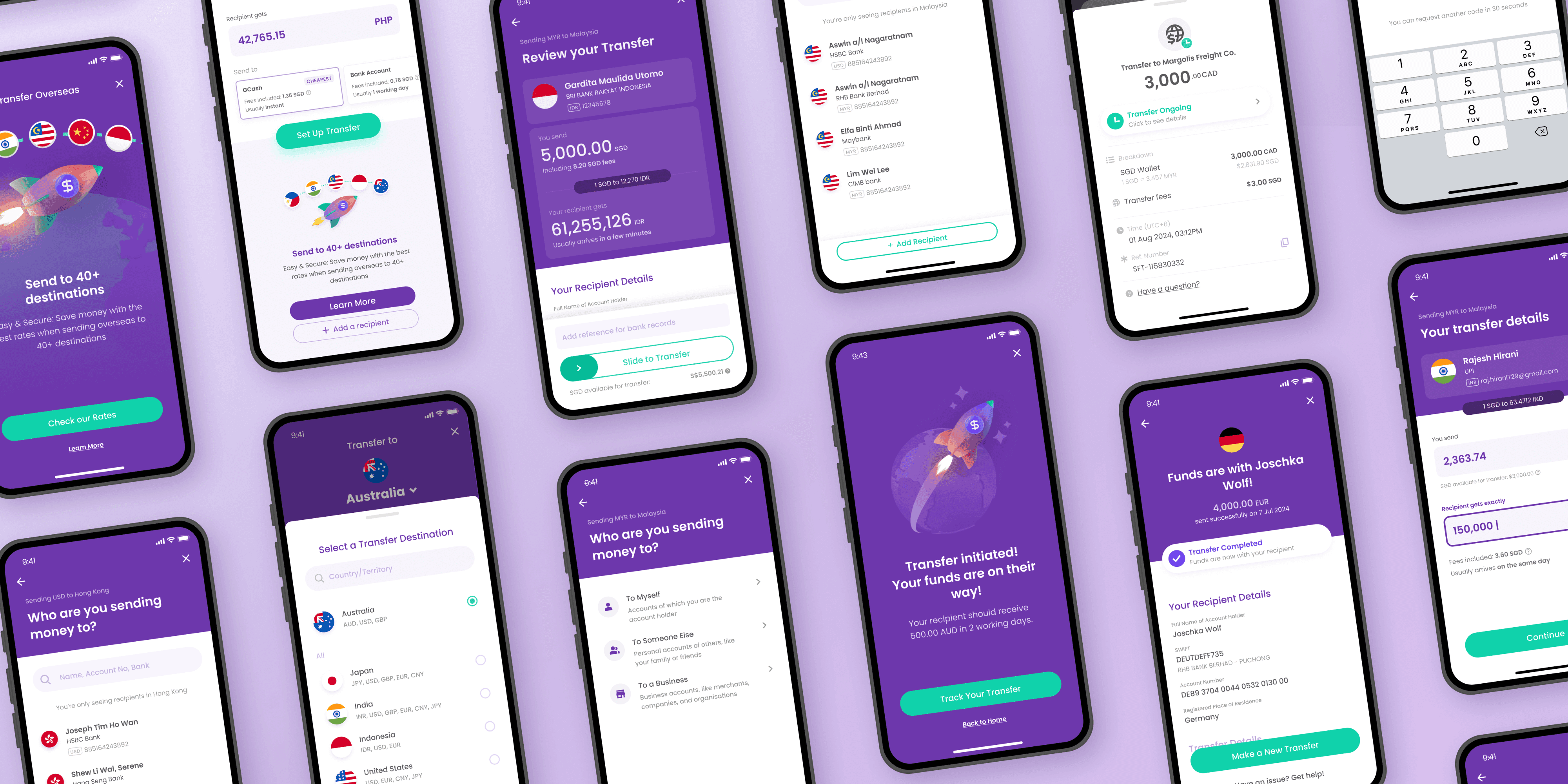
Creating clarity for a complex feature
The Challenge
Lack of internal alignment on a technically complex feature
The original Product Owner left without a smooth replacement, leaving a gap in direction and product knowledge.
Stakeholders and the newly-formed working teams were misaligned on scope resulting in internal conflict.
The team also needed execution clarity. We had to figure out the technical requirements of the transfer process, and the financial regulations of 60+ countries.
My role
Enabling scope alignment with stakeholers
Working with my Design Director, we defined the features for money transfer. Then, I developed mid-fi mockups and clickable prototype which were used to align stakeholders on the vision and scope of the feature.
This had an immediate impact of resolving internal leadership disagreements. Resources were committed, and timelines estimated, enabling us to move on to the development phrase.
Creating execution clarity for working team
Working with PMs, I broke down technical requirements into feature requirements.
I designed 8+ systems essential to support a money transfer, and created easily-understandable artifacts that were used by cross-functional teams as the source of truth to coordinate processes and prepare for launch.

Thanks! You saved me hours of work! The team can start on this instead of having to wait another week.
Charles, Interim PM

Whoa. This is super clear.
Adelina, PM of another feature

Design Strategy
Designing for conversion
CHALLENGE
Competing in a saturated market
As a latecomer to the money transfer space, we competed with established players like Wise, DBS, and Instarem for users.
Solution
Design for comparison, trust, and ease
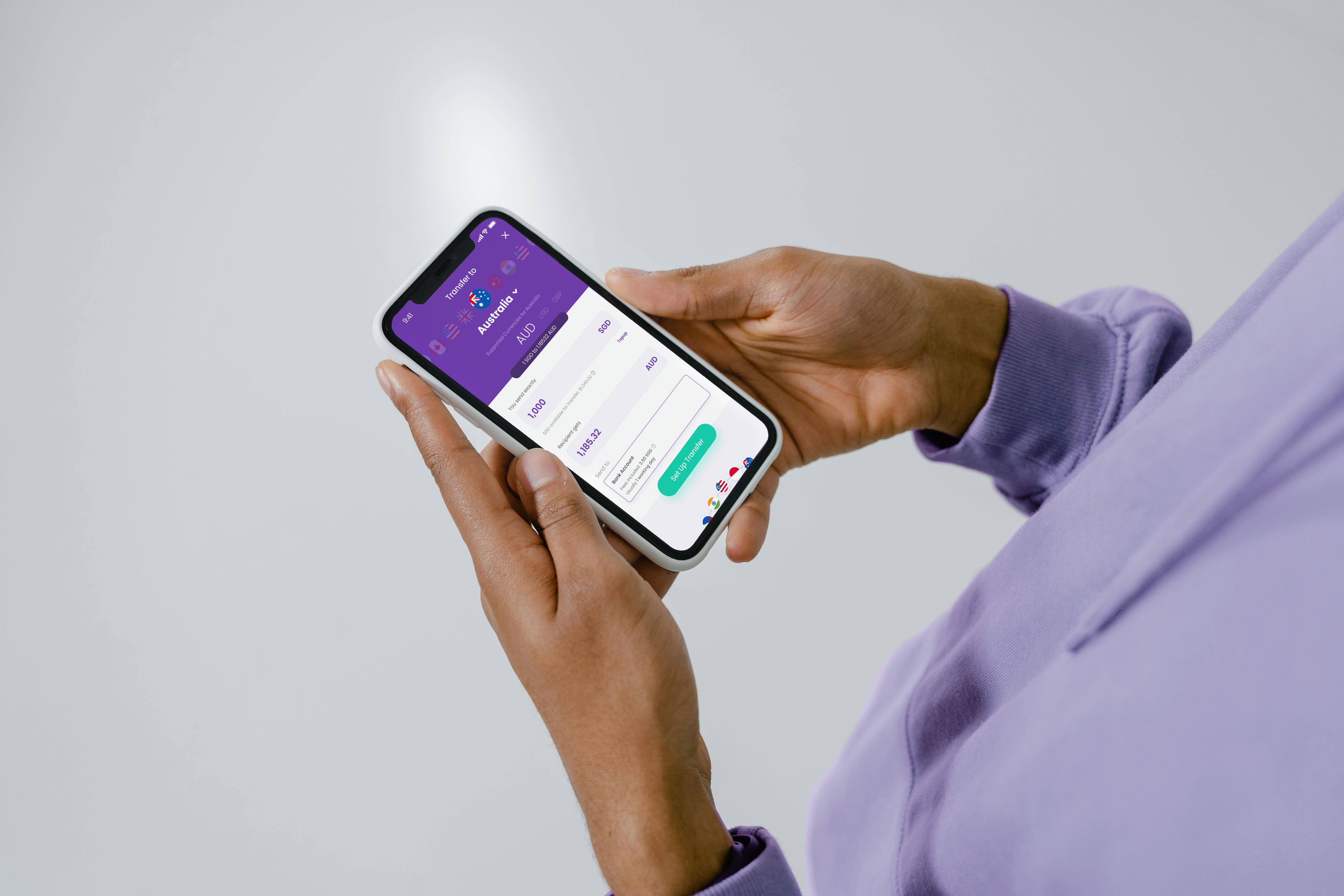
We created an eye-catching home page that allowed users to easily compare us with providers on metrics that mattered like rates and delivery times. Transfer steps were reduced to drive conversion.
Users are encouraged to explore the whole process to reduce uncertainty and increase commitment. Transfer issues like insufficient funds are only blockers at the final step of review.

An early-stage Figma prototype of the landing screen. Test participants intuitively knew what the slider would do and were intrigued by them. Their interest in interacting with the sliders gave us some confidence our strategy could work.
A prototype demonstrating the finer points of microanimation. This helped stakeholders buy into the proposal, and for devs to replicate the interaction. Try it here. If viewing on a mobile device, haptic feedback is included.
Design consideration
Balancing ease with information accuracy
The highest friction point of the experience is adding recipient information. While we wanted to reduce user effort, we had to ensure information accuracy or transfers would fail.
I developed a system of guidance and checks that guides users to get the right information while course-correcting them progressively.

Improving with data
To reduce transfer failures, we iterated aggressively in early releases. Tweaking various parts of the design brought the overall rate for failed transfers from ~2% to 0.6%.
This decrease saved the business approx S$15,000/mth in failed transfer fees.
$15,000+/mth
Savings due to changes in design

Visual design
I was responsible for the overall look and feel of the feature, and worked on UI design, key visual assets, and to the smallest of visual details.


Impact
YouTrip Overseas Transfer was officially launched in March 2025.
We achieved the business goal of increasing transaction volumes in YouTrip. Within months, money transfer ibecame the 4th most accessed feature from YouTrip's home screen.
S$50M+
Transacted in first quarter
84.6%
User satisfaction from NPS