

Launching YouTrip Family
Project context and scope
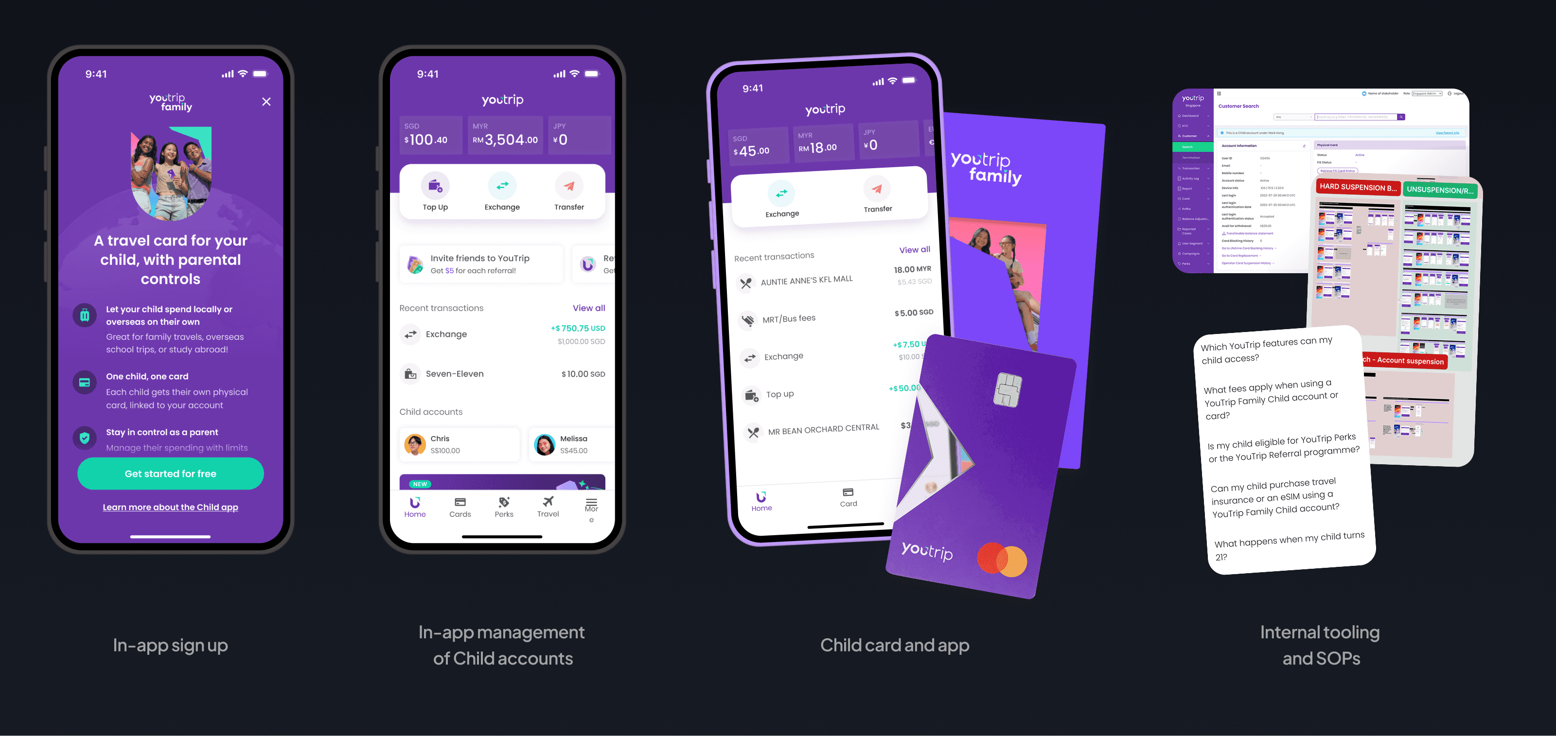
Scope
A new feature + service design
For parents:
In-app sign-up
Management of Child accounts
For child users:
New card packaging and onboarding
Management of own account
For our operations:
New processes for onboarding, authentication, notifications, card error resolutions, and customer service resolution
Constraint
A limited child experience
It was decided that children would use the same card and app as adults, with some features removed.
This severely limited the quality of child experience, but leadership was willing to make the tradeoff because the overriding concern was speed to market for validation.
Therefore, I focused design effort on the points where the adult-first approach created meaningful usability or safety gaps.
My role
Take aligned happy flows to a successful launch
I joined after the product direction and happy flows had been aligned with senior leadership.
I took ownership of :
Closing gaps in usability, experience, system, and service design
Accounting for all secondary and edge cases
Coordinating cross-functional teams through launch

My role: Executional lead
Contribution 01
Closed experience gaps beyond the brief
my approach
Adding functional and visual polish
I analysed where designs were not truly meeting the needs of parent and child users and closed those gaps, resulting in experiential and usability gains across navigation, clarity, security, and ownership.

Contribution 02
Derisked onboarding failures
A complex process with untested assumptions
Onboarding was a complex process that spread across app and physical surfaces.
The original designs assumed users would operate with perfect knowledge of the system. This was not a fair assumption.
Yet, leadership was eager to move directly into development.
solution
Uncovered usability issues, improved flow
I convinced stakeholders that the risk was worth investigating with usability testing. This uncovered 3 critical issues that would have compromised a smooth launch rollout.
These findings made the team commit resources to redesign the process.We successfully increased task success rates in internal usability tests, and had no issues at launch.
4-5x
Improvements to task success
ContributioN 03
Redesigned the app for dual card ownership
CHALLENGE
Shared card ownership presented UX problems
For both parents and children, shared card ownership risked unexpected card or app behaviours due to the actions of the other party. It was therefore crucial to help users maintain a shared understanding of card status.
Moreover, parents now had to:
Manage multiple accounts at once
Know when to act on issues on behalf of their children
Solution
A curated notification experience to support shared understanding
I designed a notification experience that kept users informed across all 16 card states and 40+ transactions types, all from their device lockscreens because it is unreasonable to expect users to tap into the app all the time.
To reduce overwhelm, changes are triaged by severity: trivial changes surface as in-app contextual explainers; only changes needing immediate action or scrutiny are escalated as push notifications.


For card issues, notifications are only the middle man between issue and resolution flows. I worked with Product, Legal, Compliance, and CS to ensure the flows of all possible card states were compliant and intuitive.

CHALLENGE
Engineering limits the ideal in-app alerts system
At tech grooming, engineers pointed out that structural limitations meant our existing in-app alerts system couldn't easily surface Child card issues on the default banner section on a parent's homescreen.
I immediately identified usability problems with this approach: it would make important alerts easy to miss on a parent's homescreen and create friction to resolution.
my contribution
Led negotiations to preserve usability
To ensure Product and Engineering had a clear picture of what was at stake, I illustrated the costs and benefits of various options, and presented them to everyone:

This helped us get buy-in to make UX and UI changes necessary to preserve usability. After alignment, I iterated the core solution to the final design.

The issue summarised
The shipped design implements dynamic order, and uses motion to get a user's attention. The order and appearance of child accounts are triaged by severity and recency to ensure parents see the most pressing issues first. Coupled with the notification system, we were confident parents would not miss important alerts.
Contribution 04
Redefined how teams worked for a more unified experience
CHALLENGE
Siloed teams led to disjointed experiences
Traditionally, YouTrip launched products in-silos. After the Product team was done making the product, Marketing and CS articles were expected to 'do their thing' for the launch.
This workflow created disjointed experiences across the app, marketing and CS experiences.
Approach
I changed how Product, Marketing and CS worked to improve co-development
I took the initiative to reach out to colleagues in these teams and build on each team's unique strengths.
With marketing, we co-developed the visual direction. This resulted in an end product was visually much stronger and unified across the product's various surfaces.

In-app visuals before and after the sync in visual direction. The AI slop on the initial Splash screen wasn't my decision, but we were able to replace it with a higher quality visual for the shipped product.
Representation for YouTrip's diverse user base: Before and after my feedback to Marketing

Approach
A seamless CS experience
We recognised that CS didn't have sufficient product expertise to develop a useful FAQ for users, but excelled at their own SOPs for a wealth of CS issues.
As such, we divided work based on our individual strengths: my PM and I took charge of creating FAQs for both in-app and web entry points, while they focused on creating CS SOPs with our feedback.


Impact
We launched in May 2026. Uptake exceeded our expectations:
2.5x
projected adoption target in the first month
Moreover, there was no spike in CS queries regarding the feature, signalling a smooth card activation and onboarding for parents and children.