
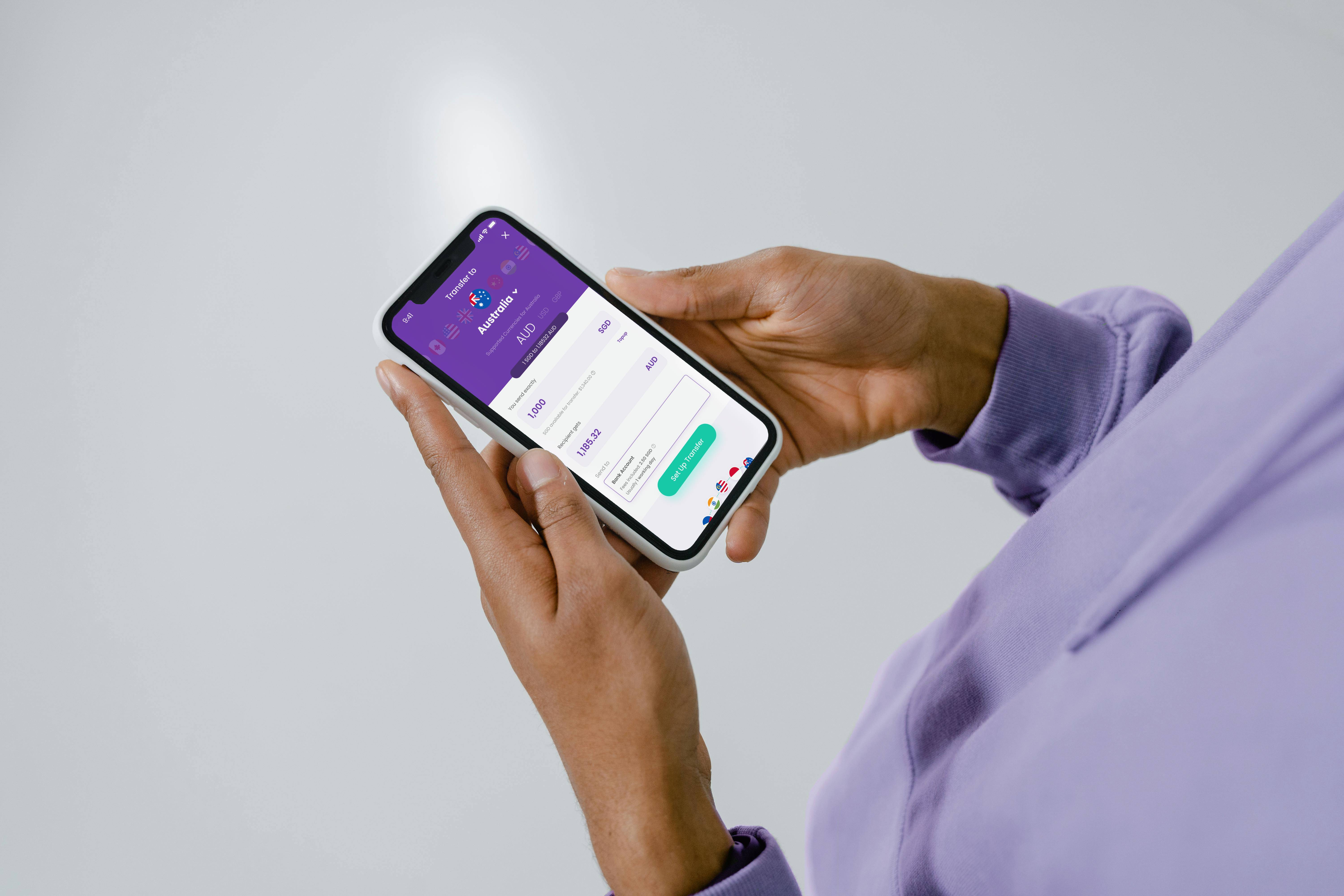
Building YouTrip Overseas Transfer
Impact 01
Creating clarity for a complex feature
Problem
Confusion about scope and execution details
The original Product Owner left without a smooth handover, resulting in confusion around the scope of the project and how to complete it.
My role
01 Created scope alignment with stakeholders
Working with my Director, we defined the scope of the feature with mid-fi mockups and clickable prototypes. This enabled us to get resources committed and timelines estimated so that the project could move into development.
02 Created execution clarity for cross functional working teams
The immediate working team lacked clarity on how to build the feature, and there were times even the PMs were lost.
I took the initiative to understand the technical requirements. From there, I designed 8+ systems within the feature and created artifacts that were used by both the immediate working team and cross-functional teams as the source of truth to coordinate processes and prepare for launch.


Impact 02
Designing for conversion in a saturated market
CHALLENGE
Competing in a saturated market
As a latecomer to the money transfer space, we competed with established players like Wise, DBS, and Instarem for users.
Solution
Design for comparison, ease and conversion
We recognised that rates and fees was our biggest competitive advantage, so my design surfaced this information upfront.
To reduce drop-offs, I designed the experience to be easy to complete, and getting them invested early.
Impact 03
Improving the first transfer experience
The peak friction point of a user's first transfer was getting their recipient information.
Recipient information can be confusing
Based on our research, we knew that they key driving factors were (1) users were unfamiliar with the transfer process, and (2) the wide variety of recipient information used across countries and transfer methods.
Solution
A progressive system of guidance and checks based around user behaviours
Given that different users needed different levels of help, I opted for progressive, contextual guidance rather than maximal guidance.
The end result is a set of customised guides and checks that gently direct users to finding the right information and prevent them from making errors.

bank code
Leading with bank names over codes
Users recognise bank names but not codes. If a list of banks at the destination country, we defaulted this as the selection method.
To make it even more convenient, we identified the top banks of each destination, and placed them at the top of the list
bank code
Surfacing bank names for user given bank codes
For channels without a bank list, we showed users if the code they entered matched a bank so that they could check that they had input the right bank.

Improving with data
Iterating with actual user behaviour drives real results. We used early releases to observe transfer behaviours of real users and iterated aggressively. Tweaking regex for different countries brought the overall rate for failed transfers from ~2% to 0.6%.
This decrease saved the business approx S$15,000/mth in failed transfer fees.
$15,000+/mth
Savings due to changes in design

Visual design
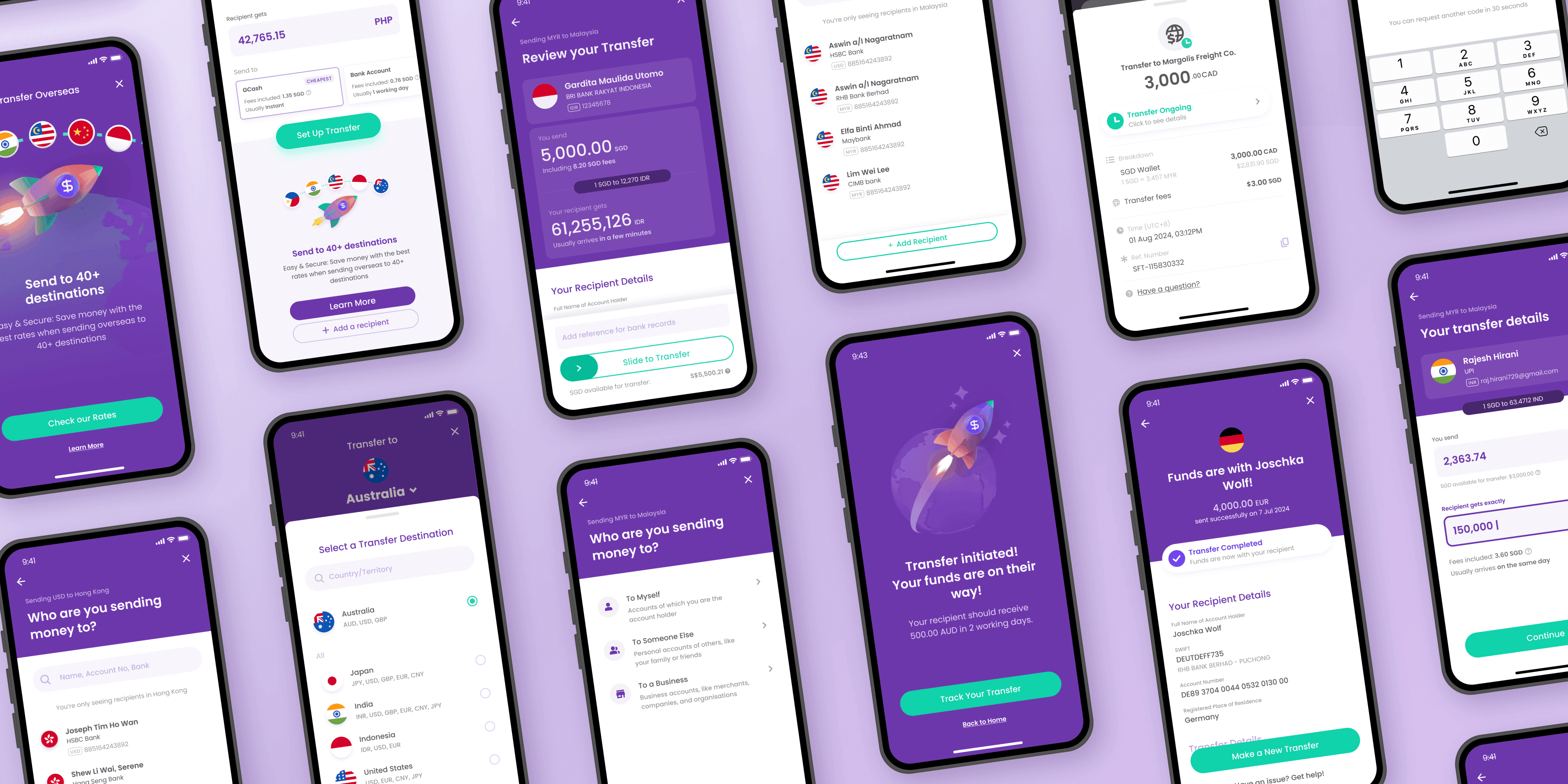
Using YouTrip's existing UI, I independently extended the look and feel to fit the needs of the feature.
The result is a feature that looks and feels on-brand while being fun and useful.


Impact
YouTrip Overseas Transfer was officially launched in March 2025.
We achieved the business goal of increasing transaction volumes in YouTrip. Within months, money transfer ibecame the 4th most accessed feature from YouTrip's home screen.
S$50M+
Transacted in first quarter
84.6%
User satisfaction from NPS